Monday, 6 August 2012

Wallpapering, amongst other things

Is wallpapering a thing? I have a nasty feeling that it's a euphemism, and I'll now suddenly attract 4,000 views over night. Anyway.

I think I got a bit excited that what with the new blog, I can post other less professional stuff here, and with my avenues wide open with grand possibilities, I didn't do anything.

In the meantime, however, I started following She Reads Truth, which came at exactly the right time for me (i.e., when I was grousing that I wasn't reading my bible or praying enough, but not actually doing anything about it, typically). They have this thing, which is an awesome Sunday School throwback, of memorising bits of the bible, and to help, created phone lock-screens and wallpapers with the verses on, which  I know sounds lame, but they're not. Honest.   

It has now got to the point where I so enjoy having something worthwhile reading when I pick up my phone (invariably to google who the guy is on the television, or watch the Lizzie Bennet Diaries on youtube), that since they haven't done one yet, I've had to do one myself. Plus, it's a really good discipline trying to fit something attractive, with text, into a 480x800 pixel area. Or at least, that's what I'm telling myself.

Drink tea. Watch the Olympics. Think about God. Try not to think about how easily someone could die in most of those sports.

Monday, 2 July 2012

Oh, oh, exciting

OK, so here's the thing. I'm trying to make a go of it in the graphic design biz. And I did some work for a friend the other day: I fancied up a poster for her, which, along with one I am doing, will be part of a display of a whole bunch (specific, right?) of posters to illustrate what the churches in our area do, shown at this enormous fair type thing in the summer. Once I have the green light on them, I'll put them on here. Anyway, she was so grateful (this was before she even saw it. Nothing to do with my skills) that she said she'd tell anyone who asked who had done their poster, and that I should give out business cards whilst working in the said display at the said fair. And then I told my Mum about it, laughing, and she said that she thought I should too.

So. It rather put a fire under me to finally decide what I was going to call this thing I'm doing. I mean, rather than 'Design by Mary'. Or something. Which would have been fine but a bit of a snooooze. So I made a decision. And I made a business card.

And I fuzzied out my details for reasons best known to my paranoid self (yes, I know, everyone reading this knows where I live and has a good knowledge of my dental records). And I'm super jazzed. And then I realised that rather than rambling like this on a blog that I could put on a business card, I should either stop that, right now, go back and re-edit all my old posts, or set up another one for the actually businessy type stuff. So I did that too.

Oh boy, oh boy.

The really jaunty thing is now, I can do stuff on here that I never really intended prospective employers to see. Like cake. And the frozen cookie dough balls that I intend to make soon. And my ukulele. And my views on all kinds of stuff. Not that I haven't been doing that all ready, but you know. Exciting!

So here we go. New adventure. Starts today. I feel like Carl Fredricksen. I'm going to go and buy me some balloons.

Friday, 1 June 2012

Seriously not good at this blogging lark...

So it has been, what, two more months? Shame. Never mind. Here's what I've been up to:
What's that? Actual genuine money you want to pay me? Oh, uh, OK. I kind of wish it had been for something that was a bit more me, though, but I was pretty pleased with it. It's one of those things that was about five times more work than it looks, but still. I love me some embossing.
I'll admit it: I'm mad-proud of this. All except some of the text spacing. But anyway. I owe everything I have learnt about creating fractals from Mr Richard Lyall and I'm very grateful. Him, and the freaky geniuses who created Apophysis 2. Also, to those kind people who create free fonts that I can download, all the while wishing that I had a spare bajillion pounds to buy the necessary software: thank you.
I feel like a teeny tiny bit of a fraud posting this one because in truth, the poster that was printed had black text. I just feared that it wouldn't be terribly visible so I swallow my artistic integrity. Unfortunately, the blue printed darker than I expected, so when I turned it into fliers, I felt justified in going with my original and most beautiful plan. Again, it probably took double the amount of time that it looks (fish background removal, fancy fractal creation, blah, blah blah) but I liked it.
 This one (and the next) seriously honed my speed-crafting skills. And it's quite me. I love a curlicue, not to mention serifs. I love serifs. And I love that using the word 'curlicue' makes me think of this. It's so gloriously darkly inappropriate for children.
And finally. This printed up beautifully. I was so jazzed. And I was very glad that I went with my decision to not try and make each letter as if it was inside a strawberry. This came out much more elegantly. And Bookman Old Style is such a great font. Seriously. Who doesn't love a good serif?

That's it for now. Have a lovely Jubilee. I might do some Queenly crafting. Between painting my kitchen, that is.

Friday, 30 March 2012

I will never get paid for this...

I think people who make a living from blogging probably post more than once every other month. Although technically, since I'm squeaking this into March, it's one a month. Just.

So. Since I last posted, Spring happened. I'm sitting here looking at blossom. And readying myself for the apple tree to kapow into bloom. And wondering whether it is actually quite warm enough yet for flip flops, because my feet are kind of cold. But never mind. Because Easter is just around the corner.

We changed the name of our Sunday School at church. I, however, keep referring to them as 'Pleasure Seekers' which apparently, isn't very helpful. This is a combination of two different elements first designed by my friend and fancy artist, Grace Wallis (whose studio you can check out at the Mistley Quay Workshops, next to the Mistley Quay Cafe which is so great I can't even tell you). We sent each other about 4 million emails over this. It's pretty jaunty though, which is really what I was going for.

 I've been working on this for ages. Not that it has really taken all that long. I just kept doing things, and then not doing anything with them. However, I was hurried along by the fact that the church APCM is this Sunday, which is, yes, April 1st. I suspect this might have been a massive error in scheduling. We shall see. I do love a good twiddly bit of writing. And acorns. And, more specifically, whistling in their cups. It's a life skill, people.

This was one of those projects where my remit was both vague and yet very specific. It was a bit of a Hail Mary play from those organising it, and they asked me to do it, kind of last minute. I was sent all of the emails between the organisers, plus several text files with slightly differing versions of the above. And the fact that there was to be an image of hands. And the image at the bottom. Neither of which I had. Or was sure of. So I guessed. The hand border sort of happened on its own, coming from a combined need for the (mysterious) hand image and something to finish it off. I'm not sure that it isn't very slightly creepy. Like some of the Russian clay-animation I watched at university.


This was one of those incredibly maddening projects where it turns out, many hours in, that you didn't think it through well enough at all. This seems to happen most with me when wrangling with a particularly tricksy noticeboard that stands outside of Mistley Church.

Here. Thanks to Google Maps I have found it. It looks innocent enough. It is, however, my kryptonite. It happened once before, at Harvest. This was, at least, on the computer, so rewrangleable. But still. Maddening. I somehow forgot that the poster had to fit in this noticeboard, therefore necessitating four landscape A3 posters. Which could also be used in other places. So it also had to fit on one A3 poster. And as this noticeboard is only readable from the pavement, it had to be bright enough to make you come and look at it. And, since we're trying to promote a 'One Church, Two Locations' message, it had to include all of the services for both places. Oh, and since we're a church, I also needed to include something of the actual message of Easter, rather than my first attempt which was a very nice sunrise. It might as well have been a jolly Easter bunny. And chicks. And eggs. Anyway. I'm over it.

I do, however, really enjoy writing like this. I'm particularly pleased with the Sunday text. And the benefice name came out really nicely. I'm not so sure about Friday. It seems a bit squashed up. Given some more time, I probably would have taken another go at that one.

So. I now need to turn these into service sheet covers. Which will, no doubt, take about fifty times longer than I think it will. Oh joy. Never mind. I'm having my hair cut later. It'll give me some kind of reverse-Sampson strength. Hopefully. Enjoy the daffodils!

Wednesday, 8 February 2012

Marathon failure

I've been busy. And it has been snowing here. Which naturally means that I have to play outside rather than sitting in front of the computer. So I've failed spectacularly at the marathon. Maybe next year. Or I'll designate March. Or July. Or something.

I did this yesterday though. And I liked it. I think I might need a copy for my kitchen.

Right. Off to achieve. Ticking off to-do list and all that. Make a snow-angel for me.

Thursday, 2 February 2012

Indecision

Snow has stopped play. Or rather, the thing I normally do on a Thursday has been cancelled because it's too cold and the heating wasn't working. So. One whole day in which to do several actual work things, and then maybe, maybe, see if I might have time to draw a Picture Book. We shall see. Until then, you should watch this. I saw it yesterday. And was frozen throughout. And learnt some very useful lessons about wolves. So. Just in case it gets even colder and wolves reappear, arm yourself with a knife, broken whiskey miniatures, gaffer tape, and trees. Please, please, climb trees. They can't, you know. You, however, can.

Monday, 30 January 2012

Catch up

So Picturebookruary begins on Wednesday. And I have only just started to think about it. And it feels like it has come round alarmingly too soon. Except, of course, my god-son, born on the 31st of January, is about to be 1. So to him, it has been a while. A lifetime, if you will.

So. While I think about that, pondering whether there really are enough hours in the day to do this again, I'll catch you up with some of the other designage that has been going on here.


 What's that? These are all remarkably similar? And isn't that the angel from the Messy Church poster? Fine. Dag nab it. Yes it is. But I was going for a theme. And those angels took hours. My only regret really was that on the above poster, the snowflakes didn't quite work. That's what you get for crafting individual snowflakes. A proverbial slap in the face.

I really liked this colour palette, though. And it really wasn't my own idea. I took a whole heap of inspiration from the murals of David Hetland, about whom I can find next to nothing. The only thing I could find was this flash presentation on the Minnesota Public Radio website. Given how beautiful they are, it's a crying shame that there aren't better quality photos available of his work.
The minimalism of this poster was necessitated by a) my hatred of the kinds of posters you see outside churches (small children, gazing wistful, lit by candles. Meh) and b) everyone having forgotten that this poster needed doing. Never have I worked so fast.

Oh, and having left it so long, now there's another Messy Church poster:
 Yes, it's about one degree outside today, and yes, snow is forecast, and yes, I still have paper snowflakes up in my windows (it's Winterval, don't you know), but as the nice man decorating the bathroom right now said, people are fed up of winter. So I embraced spring. And what is more springy than lambs and swallows? I'll tell you: nothing. Except maybe rabbits.


Friday, 2 December 2011

Busy busy busy

So the colours don't line up (though they didn't need to - thank you divided-notice-board). And I had an afternoon whacking my head against my keyboard because I didn't really want to add the information for this poster. It was better unadorned. And the snowflakes are not, in fact, each unique. Quite the reverse. But that was going to take a couple-of-days-job (it took several runs at it before it resembled the scene I was actually shooting for) rather than three weeks. And given it was only up for a week (and may be still up since I keep forgetting to take it down) and was only visible from the animal sanctuary cafe across the road, it probably wasn't worth it. But still. It turned out pretty good. Or at least, within a mile of how I imagined it.

Thursday, 1 December 2011

Starting December as I mean to go on. In a way...

The chances of my posting throughout December are slim. I had planned to post regularly throughout November. I failed. I did, however, read the foreward, preface, and first chapter of Behold The Lamb of God: An Advent Narrative this morning, while sitting in bed, drinking Christmas tea, bathed in fairy light-glow. And I felt that I should mark the occasion.

Have a very Happy Advent.

Saturday, 24 September 2011

Radio silence: Part IV: Mistley-palooza

So I'm making up for lost time.

After Mistley Movies came a pretty concentrated spell of work for the Mistley Church Hall Centenary. Now, here's the thing. Should you search online, you may well discover something of a lack of information about Mistley Church Hall. You can try to search for The Institute, which is what it used to be known as, but you'll find similarly little information. I did, however, find this picture, courtesy of the Essex Record Office.


It's actually of the whole of Mistley Quay, including our old friend, Mistley Towers. Check out the previous post for some pretty Robert Adam designs, and swoon over the neoclassicism. Try not to whistle the Pastoral Symphony and imagine multicoloured ponies. I dare you. Anyway. In the bottom right corner, half chopped off, there is Mistley Institute, or Church Hall. Google Street-view is the only other way that I've found to get an image of the hall. Here:


View Larger Map

I should say, to stave off any danger of being beaten by the nice man who runs the hall, that it looks much better right now. It has been freshly painted and looks, dare I say it, pretty good. This is, therefore, not a fair representation. Use your imagination.

Anyway. Long story short, this year is the hundredth birthday of the hall. I was asked to do an all-events poster, and then was asked to do one specifically for the Hog Roast and Barn Dance, and the tickets for said Hog Roast and Barn Dance. I got to flex my Seven Brides for Seven Brothersian muscles. Fun.

Having no decent pictures of the hall, I pieced one together off of Google Street-View (yes, I'm that dork) and then incorporated it into my line-drawing border. It came out pretty nicely, I think. I am a sucker for a proper script font. And calligraphy. And twirly bits. I should use a more technical term, but you know what I mean. 


My first attempt at this didn't come out very well at all, which was weird, given that pretty much every single one of the above elements was there. My Mum, however, gave me some sound advice, and after splitting up the text, making some bits bigger, some smaller, it came out pretty much like this. And then she told me to colour the images, and I objected, then tried it out, then reluctantly agreed. I think she might have been on the phone the whole while as well. Anyway, I was really pleased with this one. I cannot, however, take all the credit for the dancers. I adapted them from images I found which were, originally, 1950s embroidery patterns. I love these patterns. I think I may need to learn to embroider properly, just so that I can have cushions with these on. I did, however, tone down the fussiness of the girls. They originally had flowers on the dresses and bows in their hair which was all a bit too much. I also couldn't decide what colours to do their dresses, until, having decided on the boys' shirts, I then checked Seven Brides for Seven Brothers and matched the right shirts to the right dresses. Yes. I know. 

Naturally, the tickets then also had to match. You can't use all those fancy fonts and then do something in Arial. That's just not on. So I did these as well:
I actually designed them to be on white, but they were printed on colour, so I thought I'd recreate them, as they were. They took a while, but I was pretty pleased with how they turned out. I really enjoy doing this kind of writing. Until I get better at it, I semi-trace a good script font, adapt and add as I go, and then go back over it to thicken some lines and neaten others. I don't really write very well on an angle, so I really need to learn better. It's much easier on paper than a graphics tablet, for some reason. Practice, however, makes perfect. Or at least, better.

On the same theme, although not entirely related to the hall centenary, I was also asked to do this:


Again, the text was a big deal for me. I also discovered that I can't draw a single brass instrument from memory. Not entirely surprising, perhaps, with French Horns and Tubas, but surely I could have just about worked out how a trumpet looks? Uh, no. Being terribly self-referential, I wanted it to look like this, which, I suppose, in turn, had been supposed to look like this. I really enjoyed this kind of line drawings, though. I had been planning it on paper, and they came out pretty similarly, which was a nice look. I don't like them to look too clean and computer-ish. That said, I was also asked to do a Harvest poster for the church notice boards by hand. To make it more interesting, they had to go outside the notice boards, as we cannot currently get into them. I merrily got on with it, made stencils, sponged on jaunty harvest colours to the exact specifications of the notice boards. It was only two minutes before finishing that I remembered that the notice board was bigger than the A3 laminator to which I had access. In fact, it was more than twice A3. I would have had to chop it up into tiny rectangles before it would fit in that laminator. I kicked a few things. I stopped harking on about how much I was enjoying doing a poster by hand. I wistfully imagined just changing the size under 'Resize' and then printing the right size. I ate my dinner in gloomy silence. Then I spent all evening cutting up my poster and sticking it back together in a size that was laminatable. I even missed most of that episode of The Great British Bake-Off. All in all, a bad night, but the poster came out pretty well. All that, and I never got a photo of it. Thank goodness I can make things look pretty hand-drawn on the computer. Never again. Never. Again. 

Have a nice weekend.

Radio silence: Part III: Additional accidental radio silence

So I had a few problems trying to post last time, and I'll admit, it was quite the mammoth entry, and I suspect they both might be reasons as to why I forgot to post for a while. That was July. Now it's about to be October. Never mind. Never mind. I'm back. I'm here. I have a ton of things to post. See? My radio silence hasn't been because I was too busy watching Sleepless in Seattle  and playing Zoo Tycoon.  Except I have reinstalled it (somewhat dangerously) on my computer. And I did watch S in S last night. But that's beside the point.

So. I've had enough work since July that I've even opened a new file on my computer called 'Work'. It all feels very responsible.

So. First. The Mission Statement, aka, the one when Mary discovers that drawing people is really hard.

It's not that I didn't find drawing people hard before, but I rediscovered it. Boy oh boy. I was asked to do this for a friend's Mum's school, although unfortunately asked mid-facebook message, and so I forgot all about it for a few weeks until I was gently reminded. And then it was rather worryingly near September and so I had to work pretty hard on it. And then I rediscovered how hard it is to draw people. Especially when in a pyramid. This was my first attempt:
I had very lovely comments back, except it was pointed out that this was for an Infant School. Maybe I should have checked that first. Anyway, then I lost all confidence, and scoured the internet for pictures of celebrities with their infant school-aged children. And while I was at it, I lost all confidence about drawing people generally, so I found other celebrities who looked a bit like teachers and governors, hence why this school has, on staff, Paul Rudd, Zooey Deschanel, Doris Day, James Earl Jones and Dustin Hoffmann. Like any school really. Also, the M&S and Asda school clothing departments were a massive help. Thanks, guys.

The other thing that I was doing at about this point was the programme for Mistley Movies, our local community cinema project. I was asked to do the outside of the programme, so that the inside could be changed a few times during the season. Here's the front:
It was printed in black and white onto yellow which unfortunately somewhat lost the 20th Century Fox-esque spotlights, but this is how it was supposed to look. The drawing is of the Mistley Towers which was designed by fancy neoclassical architect, Robert Adam, and used to be the church before it was demolished, I think, because it was falling down. I kind of wish that it hadn't fallen down. It was so fancy:


It was supposed to be suitably fancy for the spa-town that Mistley was to become. I saw pictures this last weekend of the original plans. Think Bath, in miniature. Anyway, for anyone who doesn't know Mistley, I can attest: it is no spa-town. Lovely in its own right, and rammed with swans, but not a spa-town. Anyway. It was demolished around 1870 when the new church was built. The only bits that remain are the towers at either end. So this, and the swans, are pretty iconic of Mistley, and since I don't have the fondest of feelings for the swans, the towers got the film-premiere treatment.

You're welcome, Robert Adam.

Monday, 11 July 2011

Radio silence: Part II: Birthdays

Here's an interesting fact for you. I'm not sure that I've ever bought my parents or my siblings a birthday card. In fact, I'm pretty sure that I haven't. Not for me to give them anyway. They always get a hand-made offering. It's not as lovely as it sounds: my crippling inability to buy a card has resulted in some pretty spectacularly crappy cards. Several have looked as if I was seven. And not in a good way. Collages involving lentils and pasta. A lot of glitter (never a bad thing). You know the score.

So. I was tidying my room today (ready for operation: repaint and get my stuff from uni out, only three years after graduating) and came across various things. First, two offering from my brother which were GENIUS. The first was, well...


Yes. Brilliant. He made it in Publisher which my computer here does not have, hence the composite front cover and inside crafted on the magic of Photoshop. I think it was for my sister. They particularly have a strong and abiding love for Vanilla Ice. And why not. This was something of a throw back to our early computer days. Just as kids today don't know how to play outside because their games are all far too prescribed, they also don't know how to appreciate crappy computers. We had a trial version of Microsoft 3D Movie Maker. It had two characters, about three sets, two props and one piece of music. We made so much great stuff on that. It wasn't nearly such fun when we actually had a range of characters to choose from. Pride and Prejudice was never as good. Nor was Silas Marner. Anyway, that was already a MASSIVE step forward from our days of movies on PowerPoint. Yes, children, we used PowerPoint and those stick men on clip art. Remember them? I struggled to find one like the ones we had. Nowadays they're so specific. Ballerinas and babies and scoring goals. In my day they just gestured vaguely and you had to re-size and copy them into submission. So. This is what we did. That was until my brother got his hands on a copy of Photoshop. It was a vague and mysterious corner of computer geekery to me back then. It baffled me. Then, on my birthday, he presented me with these:


There is another one but the photo he chose to use of me was even worse than the other two so I have not deigned to share. I do, however, enjoy the unfortunate proximity of my hand to Warrick's ass: he doesn't look particularly impressed. Anyway, I was thrilled. He had printed them on high gloss paper and really nicely, so they looked like genuine photos. He presented them in a brown paper envelope with 'Evidence' written across it. I was in awe. 
So, this has all been a long and tortuous set up to the birthday-themed things I did this year.

First came Mum's birthday:
She had requested a printed copy of my sister's novel which she had been writing for years and just finished. My sister and I looked into various printing options and discovered that to have it properly printed was going to cost us a hideous amount so instead, we bought a massive stack of paper, binding rings and a new ink cartridge. While she did last minute edits, I designed the front cover for her. So:


There are a few things that I'd change now, and we were working within the restrictions of not wanting to use too much of the ink on one page, but I'm pretty happy with it. More than anything, I like how the word 'Albuquerque' looks. It pleases me.

So, Mum's birthday done, my brother's came next. He, much as I love him, is a pain. One year he banned an entire genre of presents. We tried to encourage him to take up a hobby that requires massive amounts of stuff that we could buy for him. He bought a ukulele. He has all he needs. Dang. So, anyway, twice a year, my sister and I sit in front of the computer, crying with laughter, trying to find ANYTHING to give him. He has come very close to getting some really odd stuff. This year, however, we were enlightened. We discussed, I used my mad skillz (such as they are) and we created this:
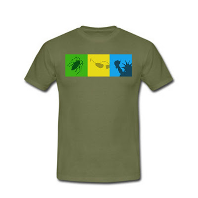
 For the refined CSI connoisseur, this is a cinch. For anyone else, it may be a little baffling. The green bug is CSI: Crime Scene Investigation: the original and, at times, the best. They use their green back-lights and their jars of creepy foetal pigs to excellent effect. Congratulations. The blue spiky lumpy thing is the Statue of Liberty, hence, CSI:NY: the third, most enjoyable and most over looked. They, too, have a love of blue back-lighting, but they add lots of glass and steel to it to make it look all cold and shiny. In the first series they also went with a weird Gothic theme. I searched online but couldn't find a picture of the original morgue. It was all tiled and vaulted and brilliant. Finally, sadly, the yellow sunglasses are the train-wreck that is CSI: Miami: it's wrong on so many levels but somehow, I know a lot of people who a) think it's the best of the three and b) largely because it's always sunny. It's not the sun, people. It's yellow back-lighting which, incidentally, spends a lot of time highlighting that the girls really need to brush their hair ( I feel so old). Also, surely the sunny jollity is somewhat tempered by the hideous murder. Is that different to my enjoyment of the CSI:NY team? I like to think so. Anyway, it is my ode to David Caruso and his Dickensesque caricature of himself.

Anyway, we gave it to him. He looked quizzically at it for a second then laughed, put it on, and now wears it often. Good boy. We also spent an entire afternoon crafting this: 
 
 The drawing was all my sister. Our scanner, however, is dreadful, so I had to go over the whole thing again before filling in all the colour blocks. Oh, and I did the title.
We based it on this brilliant picture, which is a still from the very beginning of Pixar's brilliant One Man Band. Watch it. It's one of my favourite things. Ever.

Then came my sister's birthday. Needless to say, you might have noticed that this year, there was a royal wedding going on. Maybe? Possibly? Well, actually, there were several (poor Monaco) but one in particular somewhat overshadowed the others. It also, in my sister's eyes, was looking dangerously like overshadowing her birthday as it was two days after her big day. She was not impressed. I'd say, in fact, that she was pretty annoyed. So. For her birthday, I bought her Will and Kate Top Trumps, naturally, although now, post wedding, they are seriously cheaper. Dang again. Anyway, I also made her this:
Thanks to the lovely people at Photobox it came out pretty well. And she was pleased. So I was pleased. Get in. So that was it. Three birthdays. Four projects. A bunch of stuff that turned up while I tried to tidy. A massive amount of tidying still to do. Dang once more.


Tuesday, 5 July 2011

Radio silence: Part I: Easter

So I've been away for, what, four whole months? No, I have not been lying around eating cheese and listening to Hanson. Well, not much. Not the cheese anyway. I thought it was high time I posted again with some of the stuff that I've been doing. So. First came Easter. I was asked to do the posters for my church:


These shouldn't have taken all that long. It was a lot of chopping and moving really. However, I kept on simplifying the text, and then needing to change it, so I had to go back and rewrite it again. I learned a good lesson on these. I also learned, incidentally, that Photoshop does not respond to my smacking my head on the keyboard. Strange. I also did a big Easter day poster, which I'm not sure was ever used, but I liked it:


 In case you are horrified by the fact that they don't line up together, they were intended for a two part noticeboard. If you're horrified by my love of Rockwell, get over it. It worked. I also did this for the children at the local schools:


I was kind of proud of this one. It went through about ten drafts, and doesn't look here a lot like it did when I started, but I liked it. I'm not sure that we got any extra kids to church, but it was worth a try.

So. That was Easter. I'll share some more of the last four months soon. For now though, I've got lunch to make, Hanson to listen to (no, I'm still not kidding) and the sun to bask in. Have a nice day.

Sunday, 27 February 2011

Picture Book Marathon: Day Twenty-Six: crossing the finishing line!

Creation. From an original story by God.

I've been thinking about this one for a while, and though I did have other (semi-crazy) plans for today, this one seemed right. I think I may revisit this one at some point in the future, not necessarily for picture book purposes.

So. The end of an era. A really short era, but still.

Thank you for all your comments and such. I've really enjoyed myself but, I think, the fun is not going to stop. Oh no. I'm considering setting myself another challenge. Maybe slightly less ambitious, maybe less to do, and maybe longer to do it, but I don't want to stop now. Please feel free to share any ideas you would have me do. I was given several ideas over this last month which never quite made it (see above for semi-crazy plans). They may all, at some point, appear. We shall see.  

Thanks again.

Saturday, 26 February 2011

Picture Book Marathon: Day Twenty-Five

I didn't have a lot of time today between a massively successful trip to the book fair this morning and an evening out of board games and curry, and, inevitably, that meant that my plans went spectacularly awry.

I had been thinking of some kind of Arthurian legend, but then stumbled on the fact that almost every element of it is massively unsuitable for children. Then I got caught up in Inuit mythology, but I got all a bit confused, so finally moved on to local hero, Boudicca (with various alternate spellings) who also turned out to allude me. So. Finally Boudicca Jones appeared where I thought the Icini warrior would.

Reporter/investigator, Boudicca has sass, somewhere between Veronica Mars and Lois Lane (in her Teri Hatcher phase). I'm watching the first season of V Mars again at the moment. Boy, it's great.

We're winding up, folks. Thanks for hanging around. Tomorrow, all being well, is the last day. Given that I still have one day in lieu, I suppose I could spend all tomorrow prepping for it, and slam bang you on Monday. We'll see. Either way, by midnight, Monday, I'll be done.

So. Have a happy Saturday.

Friday, 25 February 2011

Picture Book Marathon: Day Twenty-Four

It's my Mum's birthday today. Ages ago, before she and my Dad married, he got Interflora to send her daffodils- her favourite flower. Daffodils are, as you may know, dirt cheap at this time of year. Interflora have a minimum price that you have to pay them. Therefore, in a scene reminiscent of that in Big Fish, he sent her a ton (almost literally) of daffodils. They ran out of vases at my grandparents' house. Therefore, ever since, Dad gets Mum lots of daffs for her birthday. Secretly, I find it very romantic.

So. Happiness. I think, maybe, just pictures of people, happy. Swings. Sitting in a pile on the sofa with their family. Puppies. No great story. Just smiles. Sappy, but good for the soul.


My photo
I'm a self-taught graphic designer, trying to work out how to make this thing called work, work. I've also got a degree in Art History and Film Studies, an interest, bordering on obsession with animation, strong views on typography, an enormous recipe file and a well used bible.